Choosing Colours for a Home Cinema Room: A Complete Guide
Designing a home cinema isn’t just about screens and speakers—colour plays a critical role in both performance and atmosphere. The right palette can enhance contrast, reduce distractions, and create a space that feels truly immersive.
Why Colour Matters in a Home Cinema
Designing a home cinema isn’t just about screens and speakers—colour plays a critical role in both performance and atmosphere. The right palette can enhance contrast, reduce distractions, and create a space that feels truly immersive. The wrong one can do the opposite.
In this guide, we’ll break down how to choose colours for walls, fabric tracking, sofas, and carpets, and how each decision impacts the overall experience.
Unlike a typical living space, a cinema room is designed to control light and focus attention on the screen.
Lighter colours reflect light, which can:
Wash out the image
Reduce perceived contrast
Distract the viewer
Darker, matte finishes absorb light, helping to:
Improve image quality
Enhance black levels
Create a more immersive environment
That’s why traditional cinemas lean heavily into darker tones—but that doesn’t mean your room has to be all black.

Wall Colours: Setting the Foundation
🎯 Best Options:
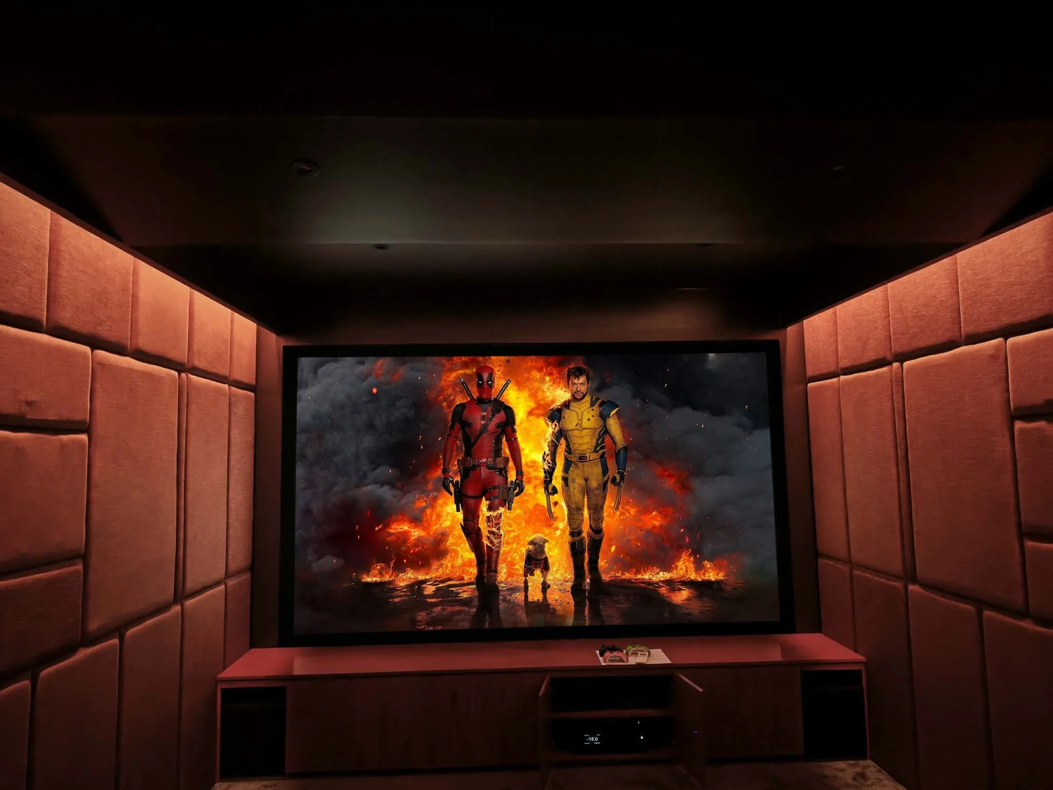
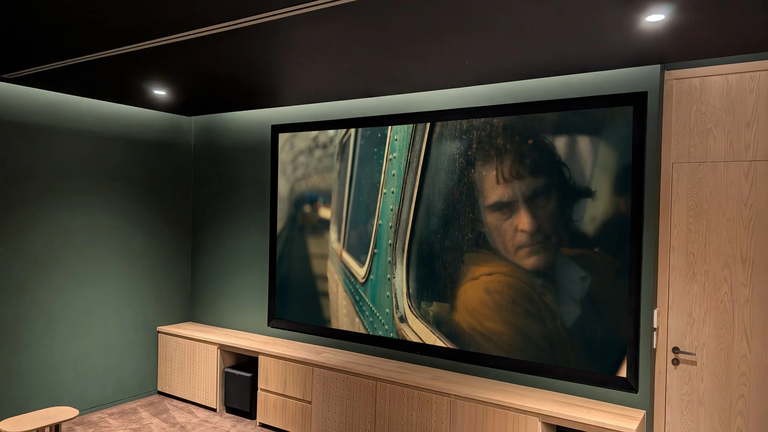
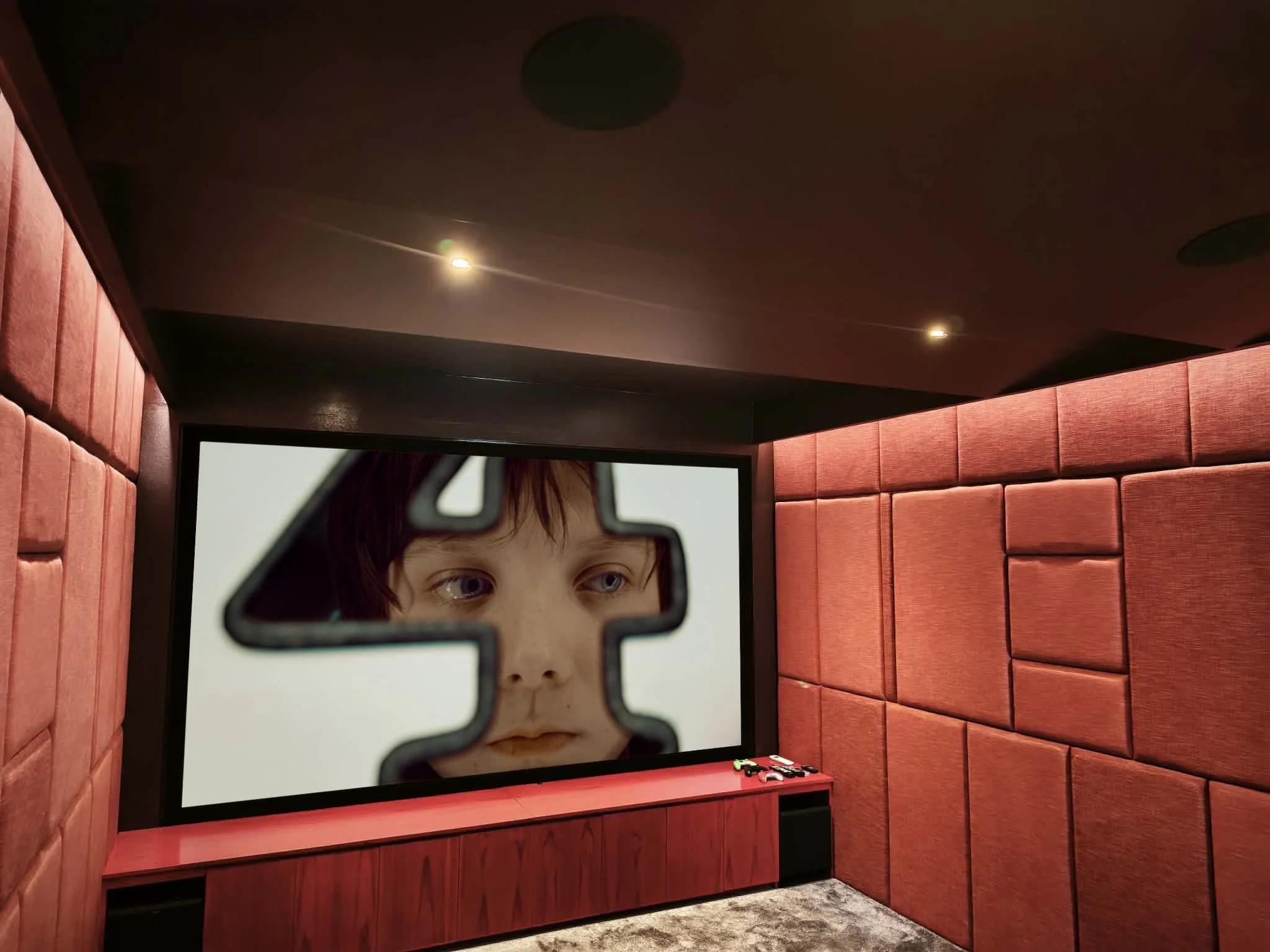
Deep greys
Charcoal
Navy blue
Rich earthy tones (dark green, burgundy)
These colours strike a balance between performance and aesthetics.
⚠️ What to Avoid:
Bright whites or creams
Gloss or satin finishes
Highly reflective paints
Top Tip:
Use matte or flat finishes wherever possible. Even a dark colour in a glossy finish can reflect light and reduce image quality.
Fabric Tracking: Performance Meets Style
Fabric wall systems are a popular choice in high-end cinema rooms, and for good reason.
Benefits:
Improves acoustics (absorbs sound reflections)
Reduces light reflection
Adds a premium, tactile finish
Colour Choices:
Black for maximum performance
Dark grey for a softer look
Accent panels in muted colours for design interest
You can introduce subtle contrast here without compromising performance—think panelled walls with tonal variation rather than bold contrasts.
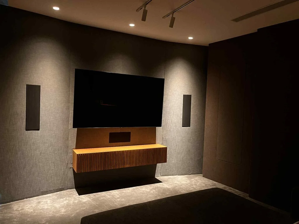
Sofas & Seating: Comfort vs Visual Impact
Your seating is often the largest visual element in the room, so colour choice matters.
Popular Choices:
Black leather (classic cinema look)
Dark grey fabric (modern and versatile)
Deep colours like navy or brown
Things to Consider:
Lighter sofas can reflect light back onto the screen
Leather reflects more light than fabric
Texture can help reduce reflections
Design Insight:
If you want a lighter seating colour, consider placing it further back from the screen or pairing it with darker surroundings to minimise impact.
Carpet & Flooring: The Unsung Hero
Carpet plays a bigger role than most people think—not just for comfort, but for acoustics and light control.
Ideal Choices:
Dark carpets (charcoal, patterned black, deep tones)
Low-reflective materials
Subtle patterns to hide wear
Why It Matters:
Reduces sound reflections and echo
Absorbs stray light
Grounds the room visually
A well-chosen carpet helps tie the whole design together while improving performance.
Can You Use Lighter Colours?
Yes—but with care.
If your cinema room is a multi-purpose space, you might not want it to feel too dark. In these cases:
Use lighter colours on the rear walls only
Keep the front wall (screen wall) dark
Combine with controlled lighting (dimmable systems)
Consider a TV for daytime viewing instead of projection
It’s all about balancing usability with performance.
Creating a Cohesive Colour Scheme
The best cinema rooms aren’t just dark—they’re thoughtfully designed.
A strong scheme might include:
Dark walls for performance
Slightly lighter seating for contrast
Textured fabrics for depth
Coordinated carpet to anchor the space
Avoid too many contrasting colours. Instead, aim for a layered, tonal look.
Final Thoughts
There’s no single “correct” colour for a home cinema—but there is a right approach.
If your goal is the ultimate cinematic experience, darker tones will always perform best. But with clever design, you can introduce personality and warmth without compromising quality.
The key is understanding how each surface—walls, fabrics, seating, and flooring—affects both light and sound.


Frequently Asked Questions (FAQ)
What is the best colour for a home cinema room?
Dark colours like black, charcoal, or deep navy are ideal because they absorb light and improve screen contrast.
Do cinema rooms have to be black?
No. While black offers the best performance, dark greys, blues, and earthy tones can work just as well while creating a more inviting space.
Can I use light colours in a home cinema?
Yes, but it’s best to limit them to areas away from the screen, such as rear walls or ceilings in multi-use rooms.
What finish should I use for cinema room paint?
Always choose a matte or flat finish to minimise light reflection.
Is fabric wall tracking worth it?
Absolutely. It improves both acoustics and visual performance, while also giving a high-end, custom look.
What colour sofa is best for a cinema room?
Darker sofas are ideal, but mid-tone fabrics can work if positioned carefully and balanced with darker surroundings.
Does carpet colour really matter?
Yes. Dark carpets help absorb light and sound, improving both the visual and acoustic performance of the room.
Can I design a cinema room that still feels bright and modern?
Yes—by using layered tones, subtle contrasts, and controlled lighting, you can create a space that feels stylish without sacrificing performance.
If you’re planning your own cinema room and want help balancing performance with design, that’s exactly what we specialise in at Cinema at Home.